Me
Designed it and made the calls
Came up with the idea, made the design and product decisions, ran the usability tests, and decided what changed after each round.
An iPhone alarm app for people who rely on alarms to get through the day. I designed it, built it with Claude by iterating directly in code, and tested it with 10 people over four rounds. It’s now in beta on TestFlight.
Role
Product Designer, personal project
Tools
Figma, Figma Agent, Claude, Xcode, TestFlight
Timeline
October to November 2026
Status
In beta on TestFlight
Responsibilities
Concept, interaction design, AI-directed development, usability testing, research synthesis
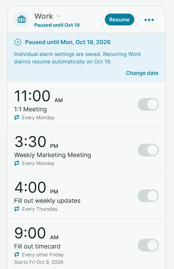
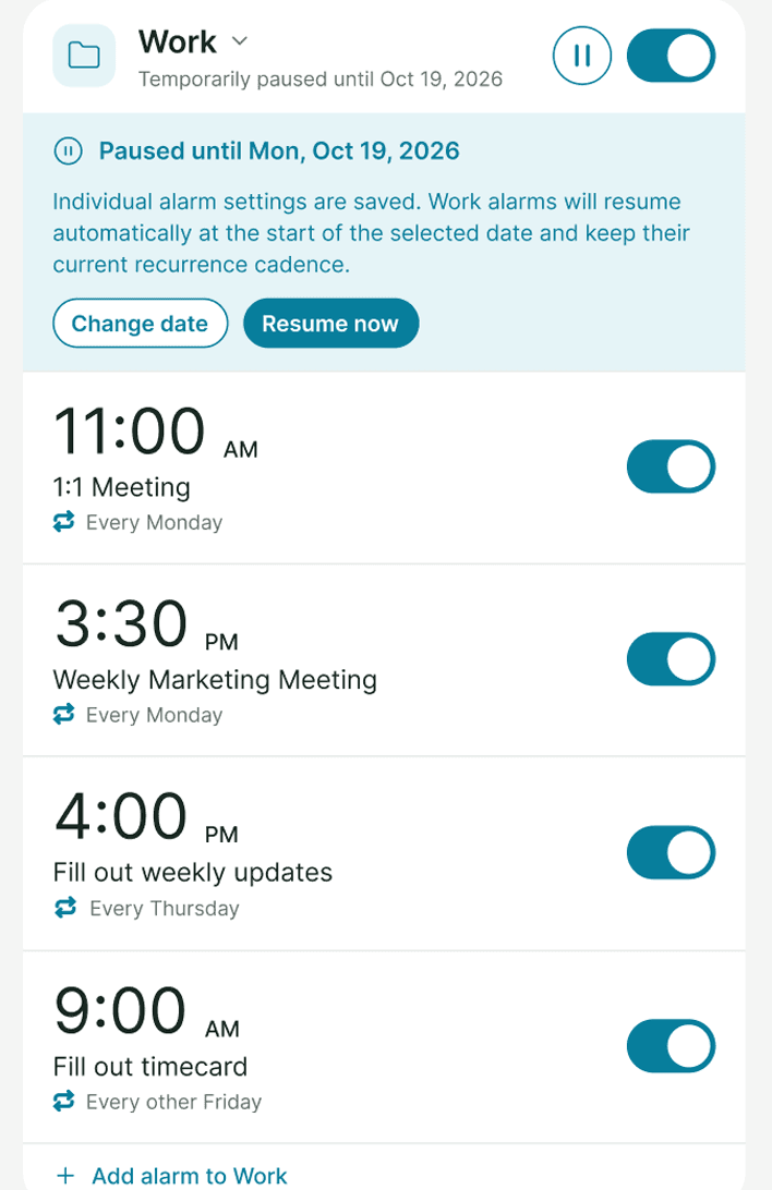
Cue is an iPhone alarm app for people who rely on alarms to get through the day, especially people with ADHD. Alarms live in groups, like Work or Self-Care, that can be skipped once, paused until a date, or turned off together. Because it uses Apple’s AlarmKit, its alarms ring through Silent mode and Focus the same way the Clock app’s do.
It started as a design exercise in Figma, and once the design was done, I wanted to keep going. I directed Claude to build it as a real SwiftUI app, made the design decisions as we iterated in code, and put it in front of people. Over six days I ran four rounds of usability testing with ten people, and each round retested the changes from the one before. The clearest example is setting an alarm to ring every two hours. No one in the first two rounds could do it, and both people in the last round did it on their own.
Came up with the idea, made the design and product decisions, ran the usability tests, and decided what changed after each round.
Wrote the SwiftUI code from my direction, reviewed the design and the code for problems, and helped me work through each round of test sessions.
Ten people, from friends and family to strangers, used Cue for the first time and talked through what they expected.
I rely on alarms for a lot of things: feeding my cats, taking medication, recurring work meetings, and reminders for personal projects. I’ve found that notifications are too easy to swipe away and forget, so alarms are what actually work for me.
The hard part is managing them. Before a vacation, I have to turn off every work alarm one at a time, then remember to turn them all back on when I get back. The Clock app also can’t handle schedules like every other Friday, or a one-time alarm on a specific date.
Until recently, third-party apps couldn’t do much better. They could only send notifications, which Silent mode or a Focus could mute. Apple’s AlarmKit framework, released with iOS 26, gives other apps access to the same system-level alarms the Clock app uses, so an app like this is finally possible.
My goal was to make a lot of alarms easy to manage, so a whole area like Work can be set aside for a vacation without anything important getting skipped by accident.
I started in Figma. Figma Agent turned my description into a first draft, and I spent most of the design phase reviewing the screens and deciding what to change, sometimes talking a decision through with Claude first. Before any code, I had Claude run three reviews of the wireframes: a heuristic evaluation, a WCAG 2.2 accessibility audit, and an edge case review. Together they turned up 27 issues, which I worked through before building anything.
These five decisions from the design phase shaped the app the most. Each is labeled with how it was made: my own call, an idea I combined with Claude’s, a suggestion I pushed back on, or something the agent added that I cut. Select one to see the conversation behind it.
Once the design held up, I wanted to use the app myself, so I built it. I directed Claude in SwiftUI and Apple’s AlarmKit, and we iterated directly in code. I’d test a build on my phone, decide what needed to change, and Claude would make the change. I made the design and product decisions along the way, like how a paused group should look and what Cue should do with an alarm nobody turns off.
Using it every day showed me problems the wireframes couldn’t, like an alarm that runs every hour past midnight, or a Lock Screen card that kept showing after an alarm had been dismissed. Each fix went into the next TestFlight build.
Building it also let me add what testers and I asked for along the way, including custom wake-up schedules for different days, location alarms, and Quiet Time that ends when you get home.
I ran four rounds of usability testing in six days with ten people who had never used Cue. Some sessions were moderated over Zoom, and others were unmoderated and recorded through a testing service, with a mix of friends, family and strangers. People thought aloud while working through tasks like setting a one-time alarm, building a morning routine, and handling a sick day.
ROUNDS 1 AND 2 · NOV 4
Two unmoderated sessions and two moderated over Zoom, one on an iPhone SE.
18 findings led to 17 changes in build 11
ROUND 3 · NOV 5
Three unmoderated sessions and one moderated over Zoom, using the same tasks so the fixes could be compared.
10 new findings led to 7 changes in build 14
ROUND 4 · NOV 9
Two strangers, unmoderated, 20 minutes each, rating every task from 1 to 10.
5 new findings led to 2 changes in the next build
After each round, I sorted what I saw into findings, decided what to change, and shipped those changes before the next round. That way each round also tested whether the last round’s fixes worked. Here are three of them.
In the first two rounds, I asked people to set one alarm that would remind them to stretch every two hours. None of the four could. The option was called “More times,” it sat at the bottom of the editor, and one person read it as nagging for a single alarm.
I moved it right under the time and renamed it, then reworked it again after the third round showed people still weren’t finding it. It’s now Additional Times, with choices like Every 2 hours, an end time, and a line that lists each ring.
Rounds 1 and 2: 0 of 4 succeeded. Round 4: 2 of 2, each rating it 9 out of 10.
Before · build 4
After · build 14
Cue can’t ring without the iPhone’s alarm permission, and the request appeared with no warning after setup. Three of four people declined or skipped past it. One read the “Alarms are turned off” banner that followed as proof he had paused his alarms.
I added a setup screen that explains what the iPhone is about to ask and what happens if you tap Don’t Allow, and rewrote the banner to say plainly that none of your alarms will ring.
Rounds 3 and 4: all 6 people allowed alarms.
Before · build 4
After · build 14
Groups are the core of Cue, and they caused friction in every early round. Alarms ended up outside their group, and a new group couldn’t hold alarms until it was saved. In the third round, all four people struggled, including one who rebuilt three alarms because she couldn’t move the ones she had already made.
New groups can now add new or existing alarms before they’re saved, the alarm editor can make a new group without leaving, and every alarm has a Move to group option.
Round 4: both people grouped their alarms without help, one rating it 8 out of 10.
Before · build 4
After · build 14
Some findings didn’t lead to a change. When one person couldn’t skip a single Friday later in the week, I held off. Pause until already covers most of those cases, and the way I’d worded the task played a part, so I’ll revisit it if it comes up again.
“This is leagues better than the alarm app.”
Cue is in beta on TestFlight. Of the 33 findings from testing, 24 shipped by build 14 and two more are in the next build. The rest are waiting on more evidence or a bigger decision.
Next, I want to test location alarms with real people, rethink whether new alarms should start as repeating, since daily tasks still get saved as one-time, and keep testing with people outside my own circle before a public launch.
Testing each round’s changes in the next round showed which ones worked. Ringing every few hours took two tries to get right, and I would have stopped after the first without the retest.
When a task pointed people toward a new alarm, they missed Wake Up’s weekend schedule. When the next task named Wake Up, the participant found the schedule and rated it 10 out of 10.
Testers showed me where Cue was confusing. Using it every day showed me where it broke, which mostly came down to timing and edge cases no one hits in a 20-minute session.
Working with Claude meant a finding from one day’s sessions could be in a tested build the next. Deciding what a finding meant, and whether to change anything, stayed my job.
I’m happy to walk through how I designed, built and tested Cue, what I’d do differently, and how I’d bring this way of working to a product team.